
 Video Mill : User's Guide
 Contents
 Language
 Product Home
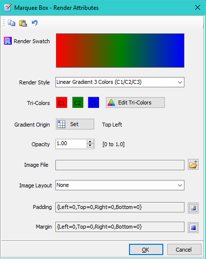
Render Attributes Editor
 Page Bottom
Render Attributes Editor
-
Render Swatch The swatch is a simplistic representation of the selected Render Style. Notes: 1) Gradient Origin, and Image Layout are not applied to the swatch; 2) If Image style is selected and the image file is empty or not found, a 'missing image' icon is displayed (
 ).
). -
Render Style - These styles define how the visual element will be rendered.
- Solid Color (C1) - The element is solid filled with Tri-Color C1.
- Linear Gradient 2 Colors (C1/C2) - For Gradients descriptions, see Gradient Style Samples section below.
- Linear Gradient 3 Colors (C1/C2/C3)
- Radial Gradient 2 Colors (C1/C2)
- Radial Gradient 3 Colors (C1/C2/C3)
- Windows Desktop Color - The element is solid filled with current Windows Desktop Background Color.
- Transparent - The element fill is transparent (no fill). Sometimes useful when you only want to outline an element.
- Image - The the specified image file is applied to the element according to the Image Layout setting (below).
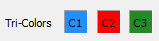
- Edit Tri-Colors - Click the Tri-Colors Editor button to edit the elements Tri-Colors. Tri-Colors is a group of three colors use for the selected Render Style. Render Style determines which of the 3 colors are used.
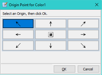
- Gradient Origin Point - When a gradient style is selected, this point defines the starting position of the gradient (Figure 3, where Color1 will appear). The gradient blending will progress from that point to the opposite corner or side.
- Opacity - Opacity of The element. (range 0 to 1.0, 0=full transparency, 1.0= fully opaque)
- Image File Name - When Render Style = Image, this is the full file path to the image file. (accepts most popular image types, PNG, JPG, etc.)
-
Image Layout - See Image Layout Samples below for descriptions of these values.
- None
- Center
- Stretch
- Tile
- Zoom
- Padding - Increases the space occupied by the element. (see examples below)
- Margin - Increases the empty space surrounding the element and its container. (see examples below)
Toolbar buttons
 To Page Top
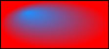
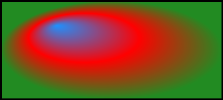
Gradient Style Samples
The Gradient samples below were created with the Tri-Colors shown in Figure 2. Changing the Gradient Origin Point (Figure 1) will produce various visual permutations of the selected gradient style.
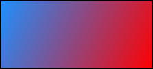
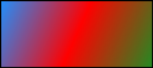
Gradient Origin Point
Gradient Origin Point defines the position of Color1(C1) within the element.
Gradient Direction
For Linear Gradient, the gradient blending will expand Colors (C1/C2/C3) from the Gradient Origin Point to the opposite corner or side. For Radial Gradient, gradient blending will expand in eliptical fashion with C1 at the center point and C3 at the outermost elipse.
Example (Figure 4): Select Gradient Origin = 'Top,Left' and the gradient expands to 'Bottom,Right' corner as shown.
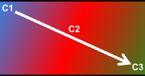
Image Layout
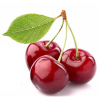 The Cherries image (left, 100px X 100px) is used for the samples of Image Layout types below. This image is smaller than the containing element. When the image is larger than the containing element, the difference of each Image Layout type is bit harder to recognize.
Image Layout = None
The image is placed in the top left corner of its container element using it's normal size.
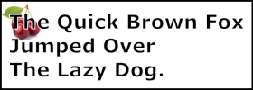
Image Layout = Center
The image is placed in the center of its container element using it's normal size.
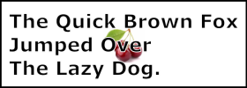
Image Layout = Stretch
The image is stretched to fill its container element. Normal aspect ratio of the size is not maintained.
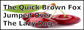
Image Layout = Tile
Image will repeat in to fill its container element. Useful when the image is smaller than its container element and you want to produce a wall paper effect.
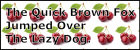
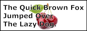
Image Layout = Zoom
The image is enlarged (or reduced in size) to fit to the height of its container element (or fit the width depending on the aspect ratio). The image maintains its normal aspect ratio. The resulting image is centered in its container element.
Padding vs Margin
These images demonstrate the difference between Padding and Margin. There are two text elements one on top ot the other. The text has a gray background mask to show the space that the element occupies.
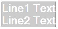
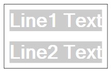
A. No Padding, No Margin
Padding: {Left=0,Top=0,Right=0,Bottom=0}
Margin: {Left=0,Top=0,Right=0,Bottom=0}
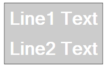
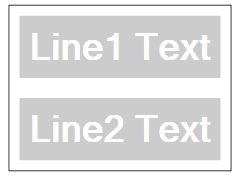
B. Padding
Padding: {Left=10,Top=10,Right=10,Bottom=10}
Margin: {Left=0,Top=0,Right=0,Bottom=0}
The size of the text letters remain the same. But the gray background mask of both elements increase in size by 10 pixels on 4 sides.
C. Margin
Padding: {Left=0,Top=0,Right=0,Bottom=0}
Margin: {Left=10,Top=10,Right=10,Bottom=10}
The space surrounding the text elements increases in size by 10 pixels on 4 sides.
D. Margin Plus Padding
Padding: {Left=10,Top=10,Right=10,Bottom=10}
Margin: {Left=10,Top=10,Right=10,Bottom=10}
The difference between this example and example C is subtle -- note where the text gray background begins and ends in both images.
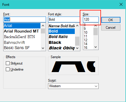
Creating Extra Large Fonts
In the Windows Font dialog, there is a Size Listbox selector with standard sizes usually up to size 72. If you need a custom size, type the size number into the Size textbox (red box Figure 5).
Free Fonts
There are lots of Free Fonts downloadable from the Web. Don't limit yourself to just what's installed with the standard Windows installation. Check out dafont or just Google Free Fonts.