
 Sound Mill X3 : User's Guide
 Contents
 Language
 Product Home
Edit Player Elements menu
 Page Bottom
Locator: Easy Player > Player Elements .
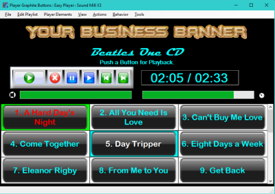
The Common Player Elements (Figure 1) are managed separately from Playlists. These settings will determine the visual appearance of these Player Elements regardless of which Playlist is currently open. Any/All of these elements can be hidden using the View menu. They can be resized to meet your needs, even large enough to be seen across the stage/room by a solo performer/presenter.
Most of these settings will require you to Rebuild the Player after making a settings change. (Actions > Rebuild Player)
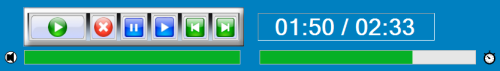
Common Player Elements
- Playback Controls Panel.
- Play Position Time Readout.
- Volume Bar.
- Play Position Progress Bar.
Player Color Theme
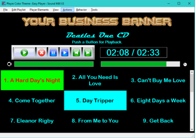
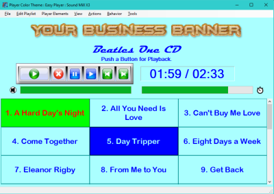
Match the Player colors to your business brand, organization or school colors. You simply pick a Foreground color for Text and a Background color for the Player panels and controls using the Color Group Editor. After setting a color theme, you can customize various Playlist attributes and Player elements to meet your needs. This is a productivity operation that sets many of the Player color settings and some Playlist color settings for the current opened Playlist. All the Player Elements and the opened Playlist cue buttons are assigned the new colors that you select. It also saves the colors as the Default Player Color Theme so newly created Playlists will have this color theme.
Menu items
- Set from Favorite Colors - You are prompted to pick to a color group from your Favorites.
- Set to a New Color Group - The Color Group Editor is opened so you can create a new Color Group (Foreground/Background color combination) to use.
Here are two sample Color Themes (dark and light). Your color selections are virtually limitless.
 To Page Top
Play Position Time Readout
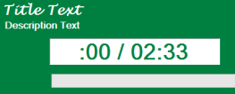
When a cue is playing, the Play Position Time Readout will always show the current playback position and duration of the current playing cue. When nothing is playing, it will display the time duration of the selected cue button.
Font Style and Size Considerations
Monospaced fonts (non-proportional) are a better choice for the Readout. A Monospaced font is one whose letters and characters each occupy the same amount of horizontal space (ie. "1" and "M" will be the same width). Proportional fonts may cause the Readout text to jitter somewhat as the characters change with each second tick. Picking a font size for your requirement. If it has to be readable you can pick one of the largest font sizes or even specify a size number in the font selection dialog. The Playback Controls Panel can be resized to match your font height (see below).
Menu items
- Set Play Position Readout Attributes - Opens the Attributes Editor to set colors, font and other appearance attributes of the Readout text and containing box.
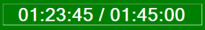
- Include Media Duration in Play Position Readout - When checked, the Readout will include the media duration (see A in Figure 5).
-
Show Time Remaining in Play Position Readout - When checked, the Readout will display the playback time remaining. (see C in Figure 5). An hour glass symbol (
 ) is displayed in front of the time text to indicate Time Remaining mode.
 - Always Match Position Readout Colors to Playlist Background - When checked, the Play Position Readout will match the background colors of any playlist you open. (Recommended: Leave this checked unless you want to fine tune the player colors for a kiosk.)
- Always Render Position Readout Colors as Reverse Video - When checked, the Play Position Readout colors render as reverse video based on the Position Readout Colors (Figure 4). Reverse video swaps the background and foreground colors. It makes the readout text stand out against the player background.
Play Position Readout - Format Examples
- A. - Play Position / Media Duration.
- B. - Play Position only.
-
C. - Playback Time Remaining. (Hour glass symbol () indicates this mode.)
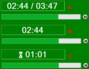
Paused Indicator: When a cue is paused, the icon at the end of the Play Position Progress Bar will show a paused indicator (as in Figure 5).
Readout Custom Width
The size of the Readout textbox is calculated based on the font size selected for the Readout. By default, it is calculated to allow for media under an hour in duration (ie 59:59 maximum). If you have media that is over an hour, you may need to expand the size of the Readout box to accommodate more characters. Changing fonts may require you to resize the readout box.
Menu items
- Use Custom Width for Play Position Readout - When checked, the Custom Width is used to calculate the width of the Readout box.
- Set Custom Width for Play Position Readout - Set this to the number of characters you need to display. Take into account whether or not you want to show the Media Duration (see A in Figure 5). And with Time Remaining mode, you will need an extra two characters for the hour glass indicator (see C in Figure 5).
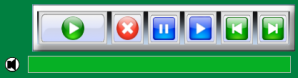
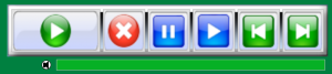
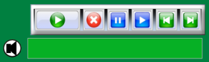
Playback Controls Panel
The Playback Controls Panel (#6 in Figure 12) lets you Play/Stop Pause/Resume the current selected cue button. The Next and Previous buttons move the selection to an adjacent cue.
Menu items
- Set Playback Controls Panel Attributes - Opens the Attributes Editor to set colors, font and other appearance attributes of the Readout text and containing box.
- Scale Playback Controls Panel Size - Set the scale factor for scaling the size of the Playback Controls Panel. (see paragraph below)
- Use Playback Controls Panel Default Background Image - When checked, the Default Background Image is displayed (a silver box, #6 in Figure 12). You can create and use your own image if you are designing a kiosk.
Scale Play Controls Size
Allows you to scale (up or down) the size for Play Controls buttons and the button container panel. The Scale factor is set as a percent of the standard size. Examples: 100% is the standard size; 200% is double the standard size; 50% is half the standard size. Allow values are between 50% to 1000%. Figure 8 shows 200% scaling (scale factor = 2.0) -- note its height compared to the standard sized volume bar.
Progress Bars Height - Menu item
- Set Progress Bars Height - This height (in pixels) is applied to both the Volume Bar and Play Position Progress Bar (#8,#9 in Figure 12). The factory default height is 24 pixels. Figure 9 shows the volume bar at height of 48 pixels. The width of these bars is always calculated based on a percentage of the Player window size.
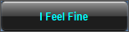
Cue Buttons
The cue button colors indicate: the current playing cue (#10 in Figure 12); the current selected cue (#12 in Figure 12); and all other cues are displayed as unselected (#11 in Figure 12). When you click play the current selected cue begins playing. The buttons are touch screen enabled.
Keyboard Navigation
Menu items
- Auto-Number Cue Button Text - When checked, a sequential number is added to all cues (as seen in Figure 12). This can be toggled on/off without affecting the text contained in the cue.
- Use Default Background Image on Cue Buttons - When checked, Default Background Image is applied to all cues (Figure 10). The Default Background Image will override (take precidence over) any Background Images that have been applied to individual Cue Buttons. Also the Show Button Background Images must be checked in the Playlist attributes or no Cue Buttons Images will be rendered. You can change the default image to your own graphic in the Player Options.
About Background Image on Cue Buttons
Figure 11 shows Cue Buttons using a Default Background Image. You can select the Background Image in the Player Options dialog. If you haven't selected one, the image shown in Figure 10 is used. If you use a Background Image on Cue Buttons, you need pay special attention to the Cue Buttons colors (playing cue, selected cue, and unselected cue). The foreground color needs to be able to show up on top of the Background Image. For example, black text (or other dark color text) will not be readable on a black Image.
Creating Your Own Custom Background Image
The image can be any common image format (ie png, jpg, etc). Design it with about the same aspect ratio that your Cue Buttons will be sized (ex square, rectangular, etc). For best visual results, make the image pixel dimensions (width, height) about the same pixel dimension that your button cues will be on your display -- no need to be exact. The image will be stretched to fit the button size but if the image pixel dimensions are too small, it may appear 'fuzzy'. In Figure 11, you will notice the image does not completely fill the Cue Button -- most prominent on Cue #1. This was a design choice to allow the background color outline the Cue Button with some highlighting color. So the image was created with a border of transparent pixels (a few pixels wide). You can of course fill the image with no transparent border as desired.
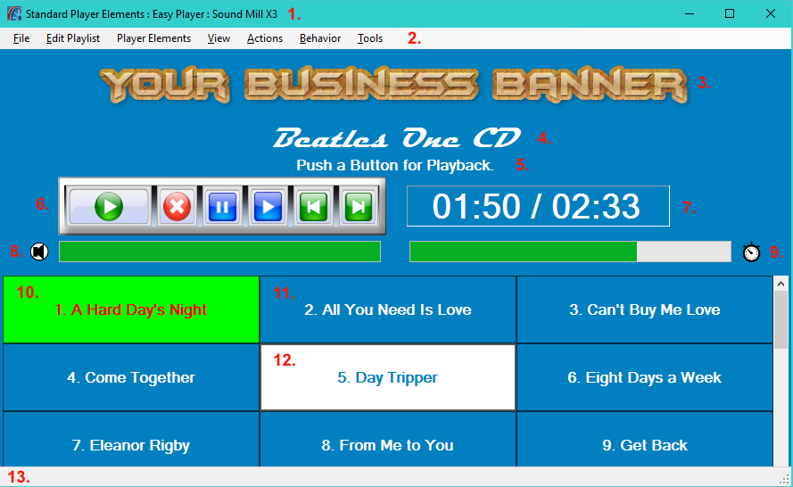
Easy Player Elements:
1. Window Title Bar;
2. Window Menu Bar;
3. Playlist Marquee Image;
4. Playlist Title;
5. Playlist Description;
6. Playback Controls Panel;
7. Playback Time Position Readout;
8. Volume Bar and Volume/Mute Indicator;
9. Playback Position Progress Bar and Playing/Paused Indicator;
10. Cue Button - Playing Cue;
11. Cue Button - Unselected;
12. Cue Button - Selected;
13. Window Status Message Bar.